Pages

Wednesday, 10 August 2011

Assignment 5: Colour - Abstraction, Perception and Modernity

While people once thought that vision was created by rays projecting from the eyes, reflecting onto objects and returning to the eyes to allow us to see, our understanding of colour vision and colour has come a long way. Artists have discovered that the relationship between colour and vision is a subjective, physiological and psychological one.
  Weavers and Michel Eugene Chevreul contributed to the discovery that colour vision is subjective as they noticed “accidental colours” and “Simultaneous Contrast”, which shows the optical effect colours have in relation to one another. Particularly with complementary colours, when the same colour has different coloured backgrounds, the colour appears lighter or darker.
 Polymath Goethe discovered that colour is a sensation for the eye. He experimented with volunteers, asking them to describe their experiences of colour and light. For example, he realised the existence of the way colour and light “impresses” into the eye through the way light would leave an “after burn”.
 Phillip Otto Runge developed the colour sphere, which demonstrates the way light and shadow creates the tones of colour, and painted morning and day to exemplify the affect of changing light. JMW Turner also believed in the subjective influence of light and shadow, using both to create atmospheric senses of warmth, doom, movement, stillness etc.
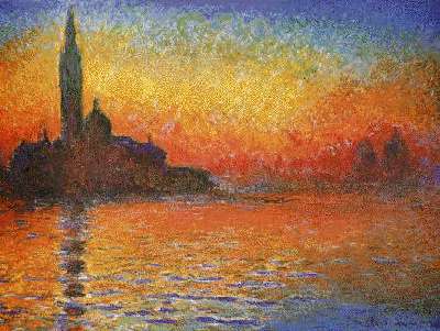
Fig. 1
Ogden Rood took simultaneous contrast to another level with optical mixing, which was a key aspect of impressionism. Artists such as Georges Seurat dabbed paint to create new tones and hues, similar to the way newspaper images are created by CMYK halftoning dots. Monet also plays on the human experience by reducing things to pure colour and shades.
 Our understanding of colour vision has been developed by artists who experiment with ways of translating human experience of colour and light onto canvas through various techniques.

Figure 1. Monet, C. (1908) San Giorgio Maggiore at Dusk  [Painting]. From National Museum Cardiff, Wales. Retrieved from http://www.intermonet.com/prints/m1768003.jpg

Thursday, 4 August 2011

Assignment 4: Ornament and Crime

 Adolf Loos suggests that “the evolution of culture is synonymous with the removal of ornament from object of everyday use”. While the idea that ornamentation is a sign of “degeneration” is too linear, societal changes have indeed influenced the nature of design. In the photo above, we can clearly distinguish between the older architecture and the relatively modern building, and see the shift from a focus on craftsmanship to more minimalist design, illustrating the effect of industrialisation. While aesthetic desire is a constant part of humanity, how this desire is expressed is influenced by society’s situation at the time. Art Nouveau came in response to successful industrialisation, giving everyday objects an ornamental aesthetic that was pleasurable and organic, rather than factory and manmade. In contrast, Bauhaus began in the post-war need for industrial and minimalist styles that will give mass produced objects a pleasurable form.
 So the nature of ornamentation reflects the nature of society, and the existence of ornamentation is more indulgent than degenerate.

Bibliography:
Loos, Adolf (1910). Ornament and Crime, 74 – 81.

Thursday, 28 July 2011

Assignment 3: Beauty + Utility

 By saying that "construction should be decorated. Decoration should never be purposely constructed", Owen Jones is implying that the functions of objects, architecture and images should be the central aspect of the design. He believed that the design should not be basing the functions around aesthetic beauty, as this hinders the "true principles" of design, creating an illusional and impractical perspective. In the context of mass industrialisation, with social and economic changes, Jones saw the influence of indulgent design and expressed the importance of using design that was honest to what society needed at the time. During the industrialisation of the UK in the 19th Century, society needed functional, rather than frivolous and wasteful, design.


Resource for image: http://www.metmuseum.org/toah/works-of-art/2000.46


This textile design by Owen Jones, "Italian" c. 1873, is a prime example of what was considered more "construction decorated" than "decoration constructed". The wallpaper has a two dimensional design that uses abstract and repetitive organic patterns, as opposed to illusionistic images that made walls appear scenic rather than flat. The use of organic visuals was part of the "true principles" that represented "construction decorated", as nature was considered an example of honest design, which I believe is functional and beautiful, and not overtly embellished.

Wednesday, 20 July 2011

Assignment 2: The Continuing Curve


In the continuum that swings between the aesthetically pleasing curve and the functional line, the iPod is an iconic example today’s "curvy" aesthetic design. Although its sleek design does not reflect the traditionally embellished styles of pleasurable design, the principles of the curve still exist. As technology becomes digital, with inherently detailed computing functions, the nature of form vs. function has been reversed. Apple presents the user of digital technology with simple user-friendly forms. Similarly, during the Art Nouveau period, inherently simple furniture is changed for pleasure, with organically detailed embellishments and curves. While one is embellished and the other is minimalist, they both play on the sensuous impulse. Art Nouveau changes the straight components of table top and table legs, providing pleasure for the household, while Apple takes away the relatively complex functions of digital technology to make it pleasurably usable.

 The physical curve remains an subtle yet intrinsic part of this sensuous design as the aesthetics of the iPods' shapes are often streamline rather than rigid, or with molten-like edges. The click wheel of the iPod is a celebration of the sensuous impulse, allowing users to control by rotational touch rather than straight clicking. Also, more technological designs are incorporating touch screen, due to the appeal of physical interaction with the screen and the play on the sensuous impulse.
 So as the pace of living is getting faster, and technology shifts to become more digital and portable, the curving and sensuous design aesthetically changes from being embellished to minimalist and streamline.

Thursday, 14 July 2011

DSDN171: assignment 1


 We are becoming more aware of the human impact on natural resources, and in aid of this Puma has released a Glow-in-the-Dark bicycle. By using solar energy, the bicycle helps reduce energy consumption. Also, the night cyclist’s visibility and therefore safety is increased. The design of this bicycle is beneficial to the user and the earth, and has a novel visual appeal.


Friday, 10 June 2011

Project 3 final: Word finals


 I used red to represent Vodafone, and the composition of the word "suck" and the dying plants represents the death of other companies.

Project 3 final: Poster in situ

This poster was placed near a Vodafone store.